Landing-page visuals sit between product assets and campaign art.
That is what makes this page different from the ad and ecommerce guides. The question here is not just which image looks strongest. It is what the page image needs to carry for conversion, clarity, and page-level consistency.
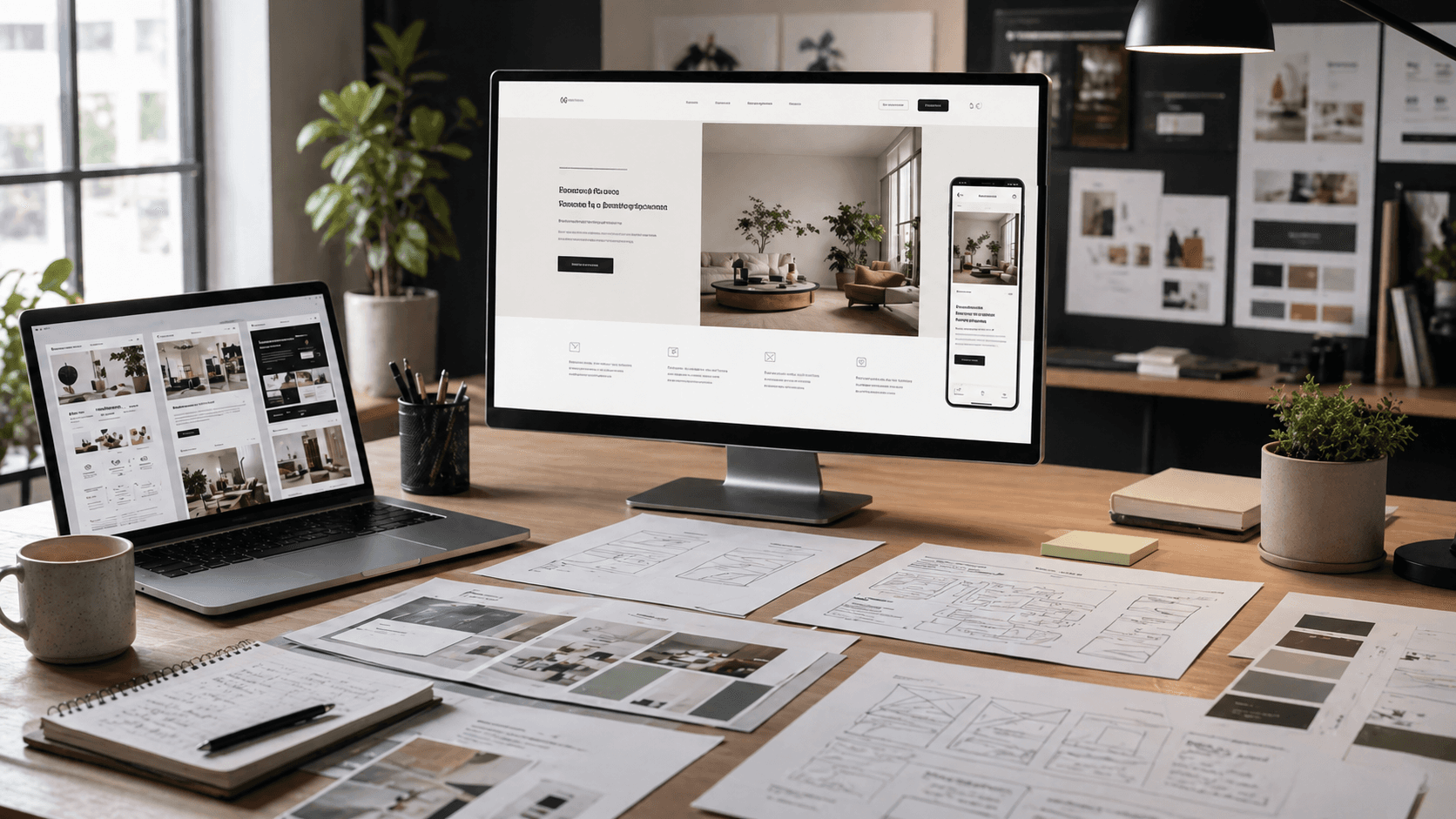
Landing-Page Visuals Sit Between Product And Campaign
Most landing-page image requests inside Rivya are really trying to solve one of these jobs:
- create a strong first hero above the fold
- keep the product and brand readable while the page sells
- support a repeatable visual system across multiple sections or variants
- create enough mood for the page without overpowering the offer
That is why landing-page visuals are neither plain ecommerce stills nor plain ad creatives.
When The Page Needs A Conversion-First Product Hero
Flux 2 Pro is still the strongest first answer when the landing-page visual has to keep product clarity, readable brand details, and commercial usability intact.
That is the better place to start for:
- product-led hero sections
- launch pages with visible packaging or labels
- conversion visuals where the product still has to read clearly
- page assets that should feel usable before they feel atmospheric
This is the landing-page path closest to product delivery.
When The Hard Part Is The Whole Page System
GPT Image 1.5 becomes more relevant when the challenge is not one hero image, but a coherent page system.
That usually means:
- larger reference sets
- repeated section variants
- stable composition across modules
- stronger control over structure than a one-off page image normally needs
Once the real problem is "how do we keep this page system coherent?" system control matters more than single-image impact.
When The Direction Already Works And Needs A Better Hero
Nano Banana Pro becomes more compelling once the page direction already works and now needs a cleaner, higher-end final pass.
That is the stronger path for:
- premium launch heroes
- sharper brand-section visuals
- higher-fidelity final landing assets
This is the refinement stage, not the discovery stage.
When The Page Image Is Really Carrying Brand Mood
Midjourney becomes more compelling when the landing page is really trying to establish taste, atmosphere, or campaign tone.
That is where it earns a serious test:
- editorial page surfaces
- fashion- or mood-led brand pages
- landing visuals where tone matters more than tight commercial readability
Once the hero is mostly carrying feeling, the mood-first path becomes stronger.
When This Is Not Really A Landing-Page Job
This page stops being the best answer when the real task is:
- paid ad creative
- store-page throughput
- broader product-first image routing
- product-photography art direction
At that point, the landing-page frame is too narrow or the wrong business context.
Where To Go Next
- If the real task is paid creative, read AI Image Generator for Ads.
- If the real task is store delivery, read Best AI Image Generator for Ecommerce.
- If the real task is broader product-first image choice, read Best AI Product Image Generator.
- If the real task is narrower product-photography art direction, read AI Product Photography Generator.
- If you need the related workflow guides, read Image Workflows in Rivya and References and Uploads in Rivya.
Build The Landing-Page Visual Brief
A landing-page image has to live inside a layout, so the brief should include the page context.
Write down:
- page section: hero, feature band, proof section, or launch visual
- product or offer that must stay visible
- desktop and mobile crop needs
- where headline, CTA, or surrounding UI will sit
- whether the image should explain, reassure, or create desire
- reference role for product identity, composition, or brand mood
This prevents the model from making a beautiful image that breaks the page once real copy and layout constraints appear.
Review The Hero In Page Context
Do not judge the image only as a standalone visual. Judge it as something that will sit beside product copy.
Check:
- product visibility at likely crop sizes
- safe empty space near copy and CTA areas
- whether the visual supports the page promise
- whether the image competes with the headline
- whether mobile framing still works
- whether the image could survive a real landing-page review
If the image is strong but hard to place, fix the composition before increasing quality. A landing-page visual wins when it helps the page convert, not when it wins as a poster.


