Landing-page visuals product assets اور campaign art کے درمیان بیٹھتے ہیں۔
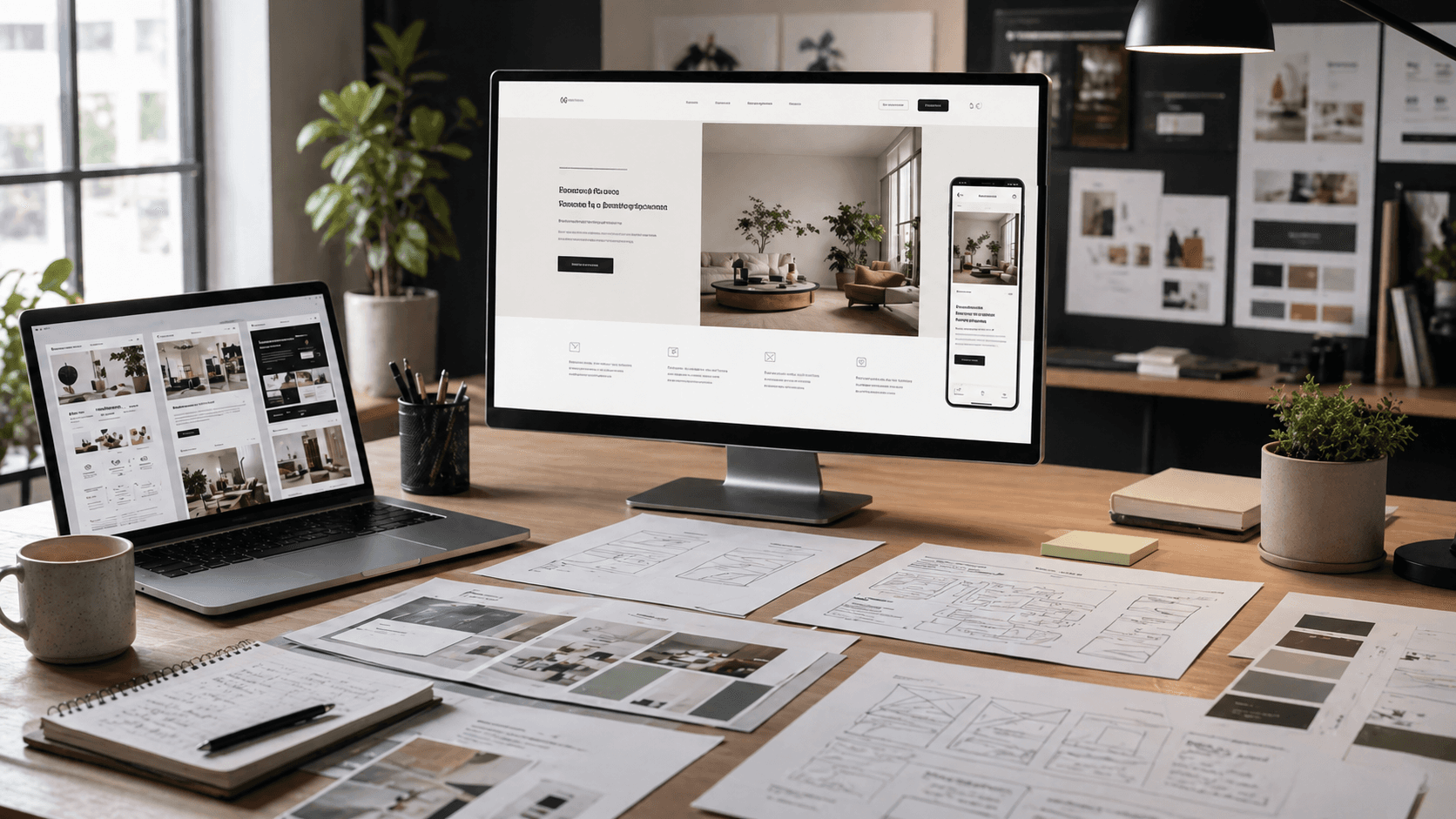
یہی چیز اس page کو ad اور ecommerce guides سے مختلف بناتی ہے۔ یہاں سوال صرف یہ نہیں کہ کون سی image سب سے strong لگتی ہے۔ سوال یہ ہے کہ page image کو conversion، clarity، اور page-level consistency کے لیے کیا carry کرنا ہے۔
Landing-Page Visuals Sit Between Product And Campaign
Rivya کے اندر زیادہ تر landing-page image requests اصل میں ان jobs میں سے ایک solve کرنا چاہتی ہیں:
- above the fold ایک strong first hero بنانا
- page sell کرتے ہوئے product اور brand کو readable رکھنا
- multiple sections یا variants کے across repeatable visual system support کرنا
- offer کو overpower کیے بغیر page کے لیے کافی mood create کرنا
اسی لیے landing-page visuals نہ plain ecommerce stills ہیں اور نہ plain ad creatives۔
When The Page Needs A Conversion-First Product Hero
Flux 2 Pro اب بھی strongest first answer ہے جب landing-page visual کو product clarity، readable brand details، اور commercial usability intact رکھنی ہو۔
یہ بہتر starting place ہے:
- product-led hero sections
- visible packaging یا labels والی launch pages
- conversion visuals جہاں product کو اب بھی clearly read ہونا چاہیے
- page assets جو atmospheric لگنے سے پہلے usable محسوس ہونے چاہئیں
یہ landing-page path product delivery کے سب سے قریب ہے۔
When The Hard Part Is The Whole Page System
GPT Image 1.5 اس وقت زیادہ relevant ہو جاتا ہے جب challenge ایک hero image نہیں بلکہ coherent page system ہو۔
اس کا مطلب عموما یہ ہوتا ہے:
- larger reference sets
- repeated section variants
- modules کے across stable composition
- structure پر one-off page image سے زیادہ strong control
جب real problem "ہم اس page system کو coherent کیسے رکھیں؟" ہو جائے تو system control single-image impact سے زیادہ اہم ہو جاتا ہے۔
When The Direction Already Works And Needs A Better Hero
Nano Banana Pro اس وقت زیادہ compelling ہو جاتا ہے جب page direction پہلے ہی کام کرتی ہو اور اب cleaner، higher-end final pass چاہیے ہو۔
یہ stronger path ہے:
- premium launch heroes
- sharper brand-section visuals
- higher-fidelity final landing assets
یہ refinement stage ہے، discovery stage نہیں۔
When The Page Image Is Really Carrying Brand Mood
Midjourney اس وقت زیادہ compelling ہو جاتا ہے جب landing page اصل میں taste، atmosphere، یا campaign tone establish کرنا چاہتا ہو۔
وہیں یہ serious test earn کرتا ہے:
- editorial page surfaces
- fashion- or mood-led brand pages
- landing visuals جہاں tone tight commercial readability سے زیادہ اہم ہو
جب hero زیادہ تر feeling carry کر رہا ہو، mood-first path زیادہ strong ہو جاتا ہے۔
When This Is Not Really A Landing-Page Job
یہ page best answer رہنا بند کر دیتا ہے جب real task یہ ہو:
- paid ad creative
- store-page throughput
- broader product-first image routing
- product-photography art direction
اس point پر landing-page frame بہت narrow یا wrong business context ہے۔
Where To Go Next
- اگر real task paid creative ہے، تو AI Image Generator for Ads پڑھیں۔
- اگر real task store delivery ہے، تو Best AI Image Generator for Ecommerce پڑھیں۔
- اگر real task broader product-first image choice ہے، تو Best AI Product Image Generator پڑھیں۔
- اگر real task narrower product-photography art direction ہے، تو AI Product Photography Generator پڑھیں۔
- اگر آپ کو related workflow guides چاہئیں، تو Image Workflows in Rivya اور References and Uploads in Rivya پڑھیں۔
Build The Landing-Page Visual Brief
Landing-page image کو layout کے اندر رہنا ہوتا ہے، اس لیے brief میں page context شامل ہونا چاہیے۔
Write down:
- page section: hero، feature band، proof section، یا launch visual
- product or offer جو visible رہنا ضروری ہے
- desktop and mobile crop needs
- headline، CTA، یا surrounding UI کہاں بیٹھے گا
- کیا image explain، reassure، یا desire create کرے
- product identity، composition، یا brand mood کے لیے reference role
یہ model کو ایسی beautiful image بنانے سے روکتا ہے جو real copy اور layout constraints آتے ہی page کو break کر دے۔
Review The Hero In Page Context
Image کو صرف standalone visual کے طور پر judge نہ کریں۔ اسے اس چیز کے طور پر judge کریں جو product copy کے ساتھ بیٹھے گی۔
Check کریں:
- likely crop sizes پر product visibility
- copy اور CTA areas کے قریب safe empty space
- کیا visual page promise کو support کرتا ہے
- کیا image headline سے compete کرتی ہے
- کیا mobile framing اب بھی کام کرتی ہے
- کیا image real landing-page review survive کر سکتی ہے
اگر image strong ہے مگر place کرنا مشکل ہے، تو quality بڑھانے سے پہلے composition fix کریں۔ Landing-page visual تب جیتتا ہے جب وہ page کو convert کرنے میں مدد دے، نہ کہ poster کے طور پر جیتے۔


