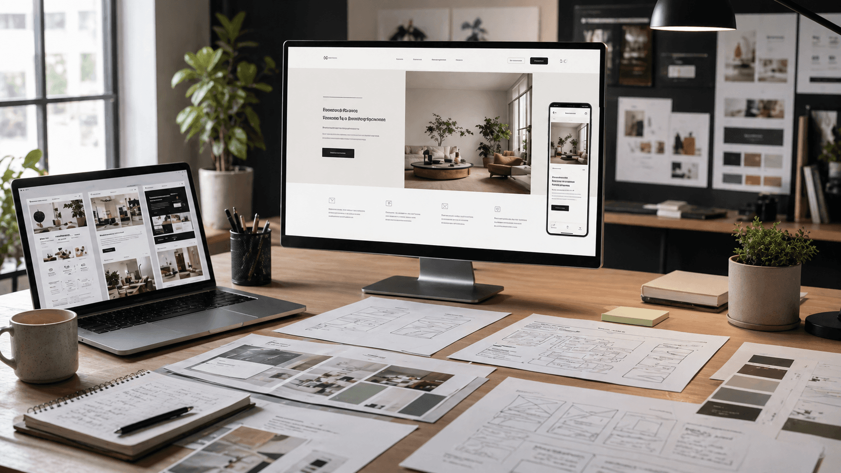
Landing-page visual은 product asset과 campaign art 사이에 있습니다.
이 점이 ad와 ecommerce guide와 다릅니다. 여기서 질문은 어떤 image가 가장 강한가만이 아닙니다. page image가 conversion, clarity, page-level consistency를 위해 무엇을 담당해야 하는가입니다.
Landing-page visual은 product와 campaign 사이에 있습니다
Rivya 안의 대부분 landing-page image request는 실제로 다음 job 중 하나를 해결하려고 합니다.
- above the fold에서 강한 first hero 만들기
- page가 판매하는 동안 product와 brand를 readable하게 유지하기
- 여러 section 또는 variant에 걸친 반복 가능한 visual system 지원하기
- offer를 압도하지 않으면서 page에 충분한 mood 만들기
그래서 landing-page visual은 plain ecommerce still도 아니고 plain ad creative도 아닙니다.
Page가 conversion-first product hero를 필요로 할 때
landing-page visual이 product clarity, readable brand detail, commercial usability를 그대로 유지해야 한다면 Flux 2 Pro가 여전히 가장 강한 첫 답입니다.
다음에 더 좋은 시작점입니다.
- product-led hero section
- packaging 또는 label이 보여야 하는 launch page
- product가 여전히 명확히 읽혀야 하는 conversion visual
- atmospheric하게 느껴지기 전에 usable해야 하는 page asset
이것은 product delivery에 가장 가까운 landing-page path입니다.
어려운 부분이 whole page system일 때
challenge가 hero image 하나가 아니라 coherent page system이라면 GPT Image 1.5가 더 관련 있어집니다.
보통 다음을 의미합니다.
- larger reference sets
- repeated section variants
- module 전체의 stable composition
- one-off page image가 보통 요구하는 것보다 더 강한 structure control
실제 문제가 "이 page system을 coherent하게 유지하려면?"이 되면 single-image impact보다 system control이 더 중요합니다.
Direction은 이미 작동하고 더 좋은 hero가 필요할 때
page direction이 이미 작동하고 더 clean하고 higher-end인 final pass가 필요하다면 Nano Banana Pro가 더 설득력 있습니다.
다음에 더 강한 path입니다.
- premium launch heroes
- 더 sharp한 brand-section visuals
- higher-fidelity final landing assets
이것은 discovery stage가 아니라 refinement stage입니다.
Page image가 brand mood를 담당할 때
landing page가 taste, atmosphere 또는 campaign tone을 세우려는 것이라면 Midjourney가 더 설득력 있어집니다.
진지하게 test할 만한 곳은 다음입니다.
- editorial page surfaces
- fashion 또는 mood-led brand pages
- tight commercial readability보다 tone이 더 중요한 landing visuals
hero가 주로 feeling을 전달한다면 mood-first path가 더 강해집니다.
이것이 실제로 landing-page job이 아닐 때
real task가 다음 중 하나라면 이 page는 더 이상 best answer가 아닙니다.
- paid ad creative
- store-page throughput
- broader product-first image routing
- product-photography art direction
그 시점에는 landing-page frame이 너무 좁거나 business context가 다릅니다.
다음에 갈 곳
- 실제 task가 paid creative라면 AI Image Generator for Ads를 읽으세요.
- 실제 task가 store delivery라면 Best AI Image Generator for Ecommerce를 읽으세요.
- 실제 task가 더 넓은 product-first image choice라면 Best AI Product Image Generator를 읽으세요.
- 실제 task가 더 좁은 product-photography art direction이라면 AI Product Photography Generator를 읽으세요.
- 관련 workflow guide가 필요하다면 Image Workflows in Rivya와 References and Uploads in Rivya를 읽으세요.
Landing-page visual brief 만들기
landing-page image는 layout 안에서 살아야 하므로 brief에는 page context가 포함되어야 합니다.
적어 둘 것:
- page section: hero, feature band, proof section 또는 launch visual
- 계속 보여야 하는 product 또는 offer
- desktop과 mobile crop needs
- headline, CTA 또는 surrounding UI가 놓일 위치
- image가 explain, reassure 또는 create desire 중 무엇을 해야 하는지
- product identity, composition 또는 brand mood에 대한 reference role
이렇게 하면 실제 copy와 layout constraint가 나타났을 때 page를 망가뜨리는 아름다운 image를 model이 만들지 않도록 막을 수 있습니다.
Page context 안에서 hero review하기
image를 standalone visual로만 판단하지 마세요. product copy 옆에 놓일 것으로 판단하세요.
확인할 것:
- likely crop size에서 product visibility
- copy와 CTA 영역 근처의 safe empty space
- visual이 page promise를 지원하는지
- image가 headline과 경쟁하는지
- mobile framing이 여전히 작동하는지
- image가 실제 landing-page review를 통과할 수 있는지
image가 강하지만 배치하기 어렵다면 quality를 높이기 전에 composition을 고치세요. landing-page visual은 poster로 이길 때가 아니라 page conversion을 도울 때 이깁니다.


